
My role
Product Designer
Team
Product, Growth, Data, Android Engineering, Backend Engineering
Timeframe
Content
Timeframe
Content
overview
BrandBee is the consumer app behind Similarweb's mobile intelligence.
Acquired as Embee, BrandBee is Similarweb's opt-in consumer panel: users earn rewards through surveys, games, shopping, and other tasks, while contributing behavioral mobile data that feeds the company's B2B intelligence platform. Users get paid; Similarweb gets data — that exchange is the entire product.


problem
BrandBee paid users every day, even when they did nothing.
Keeping the data-sharing permission enabled paid a passive $0.10 daily reward, redeemable at $3.00 — without completing a single survey, game, or offer. Both paths led to the same cash-out, and most users took the effortless one: of ~2,000 daily users collecting the bonus, only ~400 ever completed an offer. The rest waited a month, redeemed, and left.

Make effort pay. Keep the permission on.
BrandBee couldn't simply cut the passive reward. It's what keeps the data-sharing permission enabled and the panel alive. The product had to make surveys, games, receipts, and offerwall tasks worth the effort, when doing nothing already paid.
INITIAL FINDINGS
The reward had attracted the users least able to earn it.
Nearly three-quarters of daily users were retired or unable to work — home with time, but little capacity for effortful tasks. And for the lowest-income among them, a wasted survey or a possible scam was a real loss, so staying passive was self-protection, not apathy.
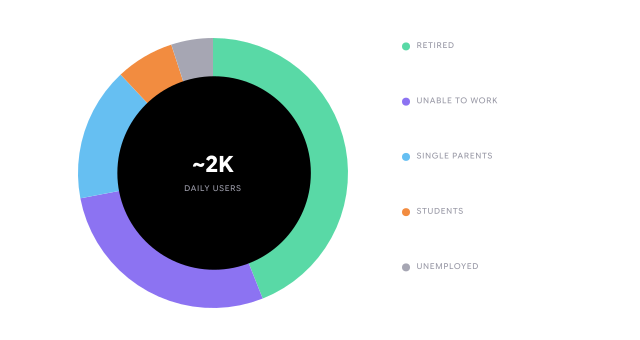
The few who pushed through showed what "worth it" looks like.
The ~400 active users were overwhelmingly single parents — ~16% of the base, but 79% of the few who completed offers. Their need pushed them past the hesitation everyone else felt, and in interviews they named what actually kept them: not the money, but the feeling of earning on their own terms. They were proof that effort could feel worth it — and the blueprint for reaching the ~1,600 who never tried.

THE INSIGHT
You can't pay your way past distrust.
The goal was never the ~400 already earning — it was the ~1,600 who wouldn't. And they weren't waiting for a bigger reward; they didn't trust the app enough to try. Their reviews don't sound curious — they sound like people warning each other: cash out before you lose it. they're watching everything you do. use at your own risk. You can't out-pay that kind of doubt. So the fix was never more money. It was making earning feel safe and worth it — what the active few had already found.
design process
From content-organized to intent-organized.
The goal was never the ~400 already earning — it was the ~1,600 who wouldn't. And they weren't waiting for a bigger reward; they didn't trust the app enough to try. Their reviews don't sound curious — they sound like people warning each other: cash out before you lose it. they're watching everything you do. use at your own risk. You can't out-pay that kind of doubt. So the fix was never more money. It was making earning feel safe and worth it — what the active few had already found.